 |  |
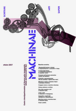
Left: Poster by Italian designer Mimmo Castellano
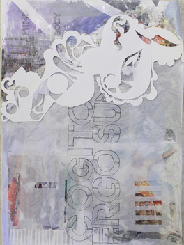
Right: my recycled design version
1. What specifically have you learned from this project? Don't only think in terms of the work you made, but also through the discussions during critique of others in the class.
After the fact, I enjoyed that the project had minimum dimensions, which forced me to work larger than I would originally choose. I also had lots of fun gel transferring all over the bottom layer, which is a technique I seldom use but enjoy the results of very much. I can also say the research that went into this project gave everyone at least a visual lesson in design.
2. If this project is assigned in the future, how might it be tweaked to enhance the overall learning experience for all students?
If this project was assigned again, I definitely think the recycled, junk-mail aspect should be played up because some students omitted it and it forces the artist to reuse and re-purpose. It should also be stressed that the students are not merely copying the design, rather they are lifting the composition, using their ideas, and creating a completely new piece.
3. How have your thoughts about design changed through because of this project.
In the original poster, the use of space is so deliberate, and space is something artists tend to try and fill up completely, but good design does not always call for that. The use of text in the work is intriguing to me as well, and is something I wish to incorporate in my own work in the future.
4. What changes would you make if you had the opportunity to re-work the image you created? I think I would glue down or get rid of entirely the tissue paper that is peeking through the white swirls. I would also try and make the text neater and smaller so all of the letters are visible to the viewer. I do like however, that mine has a colored background that I covered up and sliced only a few visible sections. The idea of concealment and layering always interests me.
